User Interface Suggestion

Would you be able to clarify what screen size you're looking at the site on, so that I can look into the scaling of items/text, as this may be an oversight and not intentional; text sizes have been increased slightly across the board in the rework so that text isn't tiny on 4k monitors, and not huge on mobile devices, but they shouldn't be at a point where they are obnoxiously large.
Would you be able to elaborate more on your point for switching between focuses/ideas/events/etc? I'm always down for feedback on this sort of thing, as what I may think looks nice, others may find horrible to use.
You should still be able to move focuses around with your mouse, though I have noticed that dragging the text part of the focus may not work on some browsers; as they use the drag functionality is overwritten with the ability to highlight text - so you need to drag the image.
By the builder being 10x larger, do you mean text is larger than the rest of the site, or larger than the old site?
Would you maybe recommend shrinking the text & buttons from the builder to something more like this:
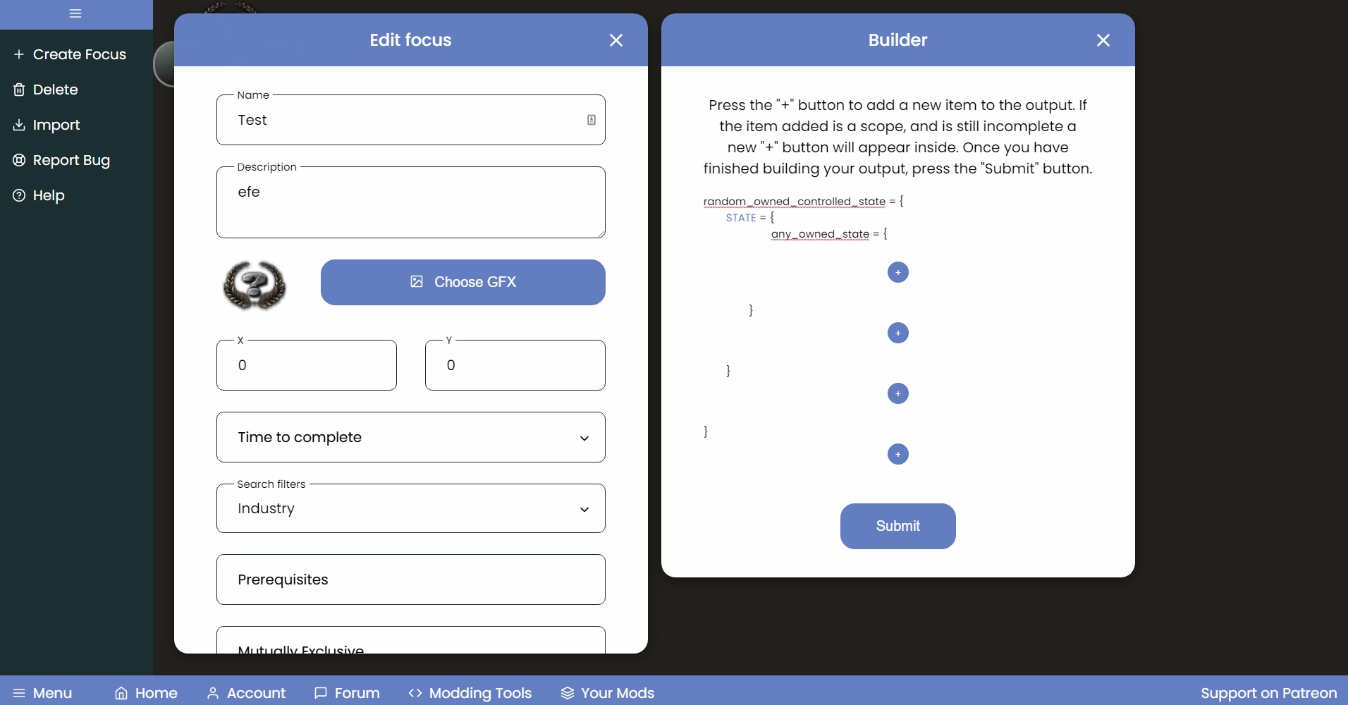

So the main grouch that I have with the new UI can be boiled down to:
-Everything has been supersized, from the builders, to the text, to the focuses, et cetera.
The reason this is an issue is that when you're trying to read over the cohesive effects or triggers, etc of a focus and you can only look at literally one effect at a time it becomes obnoxious to do simple things and to make just one focus.
Just to emphasize this issue, on the old tool I can fit: add stability, add support, trigger event, and another reward. On this site, I can fit an event trigger.
In my humble opinion, I think reducing the size back to the old norm would be the best for right now, as making a basic focus to event to idea is a slow, lethargic process when everything is screaming into your eyes.
-The new color scheme has made it hard to differentiate or find things.
By this I mean that since everything has become lighter, it results in things kind of just being obnoxious to navigate in the sense that you're looking at bright white on bright grey on very bright sky blue with the occasional black and dark blue. The colors mixing with the site's supersizing just has the website just vomiting into your brain.
-With the navigation bar being moved to the bottom, it makes it strange.
To elaborate, the bar being moved down results in the scroll bar getting in the way, it separates making a forum post and accessing your tools/account for no reason, and it's not on every page.
-Circular Frames & Removing Some Frames
I think I understand this from a website designer's perspective, but in action it's very bad. It's a small detail but it just adds onto the issue of sizing, the whole site being bright and hard to distinguish, etc.
I think that returning to making things more cozy, fitting more stuff on screen, reducing the size of pretty much everything, restoring the side bar, darkening the blue and background grey, and darkening focuses would do good.
TL;DR: The whole site feels like I'm using discord on light mode with 10X zoom.
Oh, and for reference, this is what I look at on the old and new sites.


The losing being able to move focuses around with the mouse is devastating. The way its currently set up its much faster to produce focus trees manually in notepad.
I agree, the current setup makes it easier to just manually open sublime and make focus trees than whatever wacky shit is going on right now.
There is now options to change font sizes/colour schemes on your account page, if you would like to mess around with some custom font sizes/colours. Over the weekend, I'll try and create a couple of default themes (so that you don't need to mess around with colours/font-sizes manually); but this option will always be available if you wanted to change up anything.
IsaiahTheTrooper
Hi, I'm making this post about a UI suggestion and some general observations.
So, I understand the idea behind the UI but oh my god it is horrible. Everything is so big and intrusive. It feels like I'm making a mod on my grandmother's work laptop.
I understand the UI stuff and such but everything mixes with each other with very little distinction and it's all huge so it's not a fluent process to switch between editing GFX, focuses, ideas, events, etc. The old UI would be very much preferred or just an overhaul to this one to look better would be greatly appreciated.
Alongside the UI, not being able to move focuses with my mouse is a major downgrade, and making all the text 10X bigger is awful as well, just one reward in the rewards box takes the whole space up so managing multiple rewards or intricate triggers is a nightmare.